Pantone’s Fashion Color Report
With Pantone’s statement on this fall’s fashion color report, expect to see a lot of fashion looks move towards a timeless look.

“With the beauty of the past and the spirit of the spring—recreating it with color, fabric and style this fall season.”
Pantone Inc. is a company made famous for their PMS (Pantone Matching System).
It is a system that serves as a standardized color reproduction system, allowing different manufacturers, especially in the fashion industry, to make sure that their colors match without clashing with each other.
Pantone is infamous for having the most uniquely set names for their colors, such as Tangerine Tango.
This is another characteristic that sets them apart from any other company in their field of work, while most other businesses utilize the CMYK (Cyan, Magenta, Yellow and Black) process that most people are familiar with.
It is similar to the printers that we may have in our rooms, where the variety of colors (including metallic and fluorescent) are made using those four primary ink colors.
Out of Pantone’s 1,114 spot colors, none of them can be simulated through the CMYK pigment process.
If you weren’t already blown away by this company so far, here’s the best part: Pantone’s Color of the Year.
This is an annual process where the company hosts a secret meeting in a European capital that changes annually. It is at this meeting that representatives from various color standards groups gather to debate on the color for the following year.
Last year’s color, Honeysuckle, was decided in London for the summer of 2014.
Instead of suggesting some outfits for you guys this week, I challenge you to take these colors and incorporate them throughout your whole outfit!
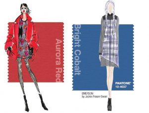
Now I present to you the Fall Colors for 2014: Radiant Orchid, Royal Blue, Aluminum, Aurora Red, Misted Yellow, Sangria, Mauve Mist, Cognac, Bright Cobalt and Cypress.


